Showing posts with label picture pages. Show all posts

Saturday, July 10, 2010

picture pages - ten


while i'm not a big fan of labels, using buzz-words to get an idea or description across comes in very handy when talking about art and ideas. if i told you that, as a cartoonist, i was looking to create "narraglyphic picto-assemblages" no one except high-minded, know-it-all hipsters would understand what i was talking about. the term simply means "comics." it's important to use terms that are easily identifiable. that's why labels come in handy. especially when describing music. if i mention that a certain band is punk or grunge or hip hop you get a pretty good idea of what to expect. so when i want to tell a story about a band but the comics medium is silent i have to use a label to describe what you would be hearing if the page had sound.

in this comic, the latest installment of caribou's adventures playing bass, a local entertainment writer describes caribou's band, julia's seizure, as "post-rock." the write up goes on to describe some key elements of the genre (instrumental, dynamic shifts, kind of moody) and mentions a key player in the genre (mogwai). as a cartoonist i chose to use a mention in a local entertainment paper to establish the band and the sound. now i can get into who these three men are and how they are going to save the world from certain doom.

about this drawing: i have been really intimidated by this page. i love music. i love the performance of music and i wanted to get the images right. my problem is the level of realism i want to put into my comics. i am not really interested in drawing photorealistic characters but i do want to draw accurate gear for my musicians. i found some photos of the incredible explosions in the sky (another band of "post-rock" instrumentalists) and aped some of the poses and instruments. i drew the last panel first and waited a week while i sketched out images of the effects pedals and guitars.

while the physical artwork took about a week to get exactly the way i wanted it, the photoshop stuff took just as long. i've stated previously here at geek style that i'm not very adept with the computer tools of illustrating. i use a wacom pad that i simply adore and a really old version of photoshop to go with my really old computer. the more i use these tools, the more practical they become to me and this page specifically has taught me considerably about what i am looking to accomplish with photoshop. i'm using photoshop to add texture and depth to my artwork through shades of gray and gray-er (if i can say that ::wink::). susen asked me why i'm just not "coloring" them with a full pallet. it's partly because i'm pretty down about my own sense of color and partly because i love reading black and white comics but mainly because i only have a monochromatic laser printer at home and don't want to pay for color ink.

the photoshop'd image came out much better than i had hoped and i really feel that i've learned quite a bit about how to get where i want to go through the process of this page.

Wednesday, June 9, 2010

picture pages - nine


s.d. smith sent me another chapter of the fledge chronicles to provide an illustration. this chapter is called the soft, gooey insides of affection. when i saw that title and read the text i knew that i was in for a stretch. sure, s.d.'s work lends itself to some obvious graphic work (that's a good thing from the cartoonist's perspective!) but this story is different. just the title alone ups the ante but the tone is this chapter is tense.

fledge's protagonist is ben gray. he is in love. the girl he is over the moon for is sarah watson. miss watson knows what's up with ben but isn't really rushing into anything, she's smarter than that. ben isn't being strung along but certainly is more emotionally invested in this relationship than the lady. because of this situation, s.d. smith is able to write truly hilarious, odd-ball tales concerning this relationship that seems destined for the annals of romantic history but must first scale, inch by inch, the rocky cliff that is love. while the payoff is huge, the build-up is tense.

so my illustration must convey that tension. my artwork needs to show ben's obvious love for sarah and sarah's desire to simply enjoy the moment while keeping her head on straight. going in i knew i would struggle with this one.

about this drawing: i decided that i would illustrate the title of this chapter, the soft, gooey insides of affection in a sort of esoteric way. when you glance at the picture you see a smashed pumpkin. but i want to your eyes to linger and get an idea of where this relationship is between these two. sarah watson is looking gleefully at a shattered pumpkin while ben gray's expression comes from knowing that he made sarah happy. the two are enjoying the same experience but are experiencing it from two very different places.

i began with the smashed pumpkin. that was the easy part. i found a photo of a smashed pumpkin (google images is a treasure trove!) and sketched it out with a non-reproducible blue pencil then inked it with micron art pens of varying thickness. my wife and s.d. himself gave me some great perspective on making the pumpkin look best. then i scanned it in and started work on the faces.

the faces took hours to complete. i have page after page of floating heads from where i was just trying to get it right. i took what i thought were the best two heads and scanned them in to place them with the pumpkin. after working with the drawings in photoshop i went back to my sketchbook to make more faces. i settled on another pair and scanned those in and proceeded to spent several hours tweaking those faces in photoshop. i repositioned eyebrows, i tilted smiles, i reconstructed jawlines...i even gave ben a nose job. eventually i was pleased with the outcome. looking back at my work progress is hysterical because the end product is nowhere near where i started. more importantly i did all the refining on photoshop with my wacom pad which is a huge step for me.

after i sent the final artwork to s.d. for approval i spent another hour or so free-handing the title in photoshop with my wacom pad. i've never drawn letters in photoshop. while they look pretty rough, now i know that i can do it.

in all i spent the better part of two days on this illustration, fourteen hours of draw time and more than a few good lessons learned.

this illustration is due to be published in west virginia south magazine in another several months.

Wednesday, June 2, 2010

picture pages - eight


about this drawing: this is a one page comic called the door. it features a character named the traveller and yes, i "realise" that it is commonly spelled "traveler" here in the us but i purposely spelled it with the double "L" to add a little depth to the character. where is he from? where is he going? what brought him down this hallway? why is there a key just laying on the floor in front of the door? who left it there and what is behind that door? as the last panel states, this is "to be continued." maybe next time we'll get to see what is on the other side of the door. maybe not.

this page was completed over a fourteen hour period with lots of stops and starts. i drew it with a non-reproducible blue pencil and inked it with black micron art pens. while penciling the page i used a straight edge for all the sharp lines but free-handed all the inks, hence the wobbly lines. i'm deciding if that is a style i will want to stick with or if i'm going to start inking with a ruler as well.

i hope you enjoy...

Monday, May 31, 2010

picture pages - seven


about this drawing: this is a one-page comic featuring a character named caribou (after the pixies song, of course). it is call "bass practice," showing caribou playing bass in his bedroom. i created this page more or less to practice some of the techniques that i've been learning over the last several weeks. i drew these panels on my large (14x17 inch) sketchbook in non-repro blue between the hours of 11pm and 2am. i used micron art pens to ink over the blue pencils and a faber-castell pitt brush pen for the guitar cable that appears in almost every frame. when the inking was complete i scanned the large artwork in three segments and combined them in photoshop. presented here is the scan with no touchups, resized for more enjoyable viewing.

nothing was playing while i created this piece but the bass lines from nirvana's "come as you are" and "lithium" bounced around in my head almost the entire time.

there is a lot more where this came from so please enjoy and check back periodically for more.

if you are interested, continue reading for the essay associated with this post...

i must say, the month of may has been very strange for me. i've drawn more pictures in the last month but it has all existed outside of the digital realm. i've filled up almost two sketch books and developed a lot more of the po-po character and her friends. i've been working more on illustrations for a children's story and experimenting quite a bit with pencils and inks. i'm almost exclusively drawing with a non-reproducible blue pencil so that i don't have to erase any pencil marks after i've inked the artwork. as i ink my artwork i have been using brush pens with varying degrees of success. in addition to the po-po coloring book and po-po comic strip, i've got two other works of graphic storytelling in the very embryonic stages. i'm focusing on finishing the children's story and po-po projects before i even work on concept artwork for the two new stories but ideas come and i keep writing them down.

i'm reading quite a few different comic books and studying the artwork and ways a story is told with words and pictures. i'm reading expositions from will eisner, scott mccloud and others in order to gain a better understanding of the storytelling process. in all, i'm throwing myself into the art of cartooning in hopes that i would someday be able to tell a good story that others might enjoy reading. all this while looking for a "straight" job. fun.

while all this art is coming out of me i have been very resistant of using the pc. it has become very clear to me that i am woefully uneducated with the various tools available to me on the computer. rather than agonize over these tools, i have turned to the traditional means of creating art. while profitable for my growth as a cartoonist it is limiting the means that i have to share my art with others. i think that once i get more comfortable telling a good story with pictures i'll add the software applications to my repertoire.

scott mccloud's most recent work making comics has really challenged me to focus on the storytelling of comics. his book includes bundles of "optional exercises" that are giving me ways to practice the principles of his theories. before i started reading the book i went through a bunch of old sketchbooks of mine and it struck me how disjointed all my work has been over the years. recently, i've been developing characters for a po-po the super cat comic strip and mccloud's book has given me some direction that i had been missing.

otherwise, i've been reading works from kazu kibuishi, tezuka, daniel clowes and many others. these three in particular have been exciting to read simply because of the craft in their work. it's easy to make a comic book. it's not that easy to tell a good story using the comics medium. i really hope that this (mostly) wordless piece presented today is a step in the right direction for me as a cartoonist.

Monday, April 5, 2010

picture pages - six


today i am presenting another workup of po-po the super cat. i drew this with the intention that it would become the cover of the book i put together for chloe. i worked with chloe on the colors of the costume, she originally picked yellow and pink as the primary colors but i was able to steer her to red and pink instead. i'm so glad that chloe wants to call herself po-po and even looks at these pictures and says, "is that me?" i'd much rather her pretend to be po-po (something i can control and influence) rather than sonic the hedgehog or a neopet.

i've spent more time than i'd like just on the logo. i wanted to make sure that i had something that i liked which wasn't easy. now i have to figure out how to use a vector editor to make a slick, professional looking logo (which every superhero needs). i'd better hurry up and finish this project because the only reason why i'm doing this is to help chloe to read and she's progressing so well and so quickly. susen and i see progress every day and that makes me so happy. i'm proud of our little girl and i hope that she can be proud of her daddy someday...

about this drawing: i started with another basic pencil drawing but i wasn't pleased with the positioning of the hands so i redrew the hands on a different section of the paper. when i inked the pencils with my light box i replaced the unsatisfactory hands with the good ones. then i scanned the inked drawing into photoshop, resized po-po, repositioned and resized the logo and cleaned the whole thing up a bit. i colored it in photoshop but chloe colored a black and white one that i had printed out and i liked her colors better (mine had brown hair and a brown tip on the tail, chloe gave po-po purple hair which looks infinitely better) so i put her page up instead of mine.

i have a b&w one up here if you want to print it out and color it yourself. good times.

more pictures of po-po are found in an older edition of picture pages.

Saturday, April 3, 2010

picture pages - five


s.d. smith has been writing a series of short stories for a regional magazine here in west virginia. all of the installments have been illustrated by some very talented artists. he asked me to illustrate the two most recent stories, the first of which was published this month and is featured in picture pages - one. i've really enjoyed the work and, along with some other projects i'm working on, i can really see how i should start taking art classes to better refine my work. as eric can attest, it has become increasingly more difficult to put down on paper what i see in my head. when writing my thoughts for this blog i make sure i pick my words carefully to properly convey my thoughts. i'm doing the same thing with my illustrations but it feels as if my vocabulary is limited. i'm trying very hard to expand the vocabulary of my art and you, my faithful readers, get to see the progress.

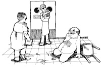
about this drawing: this is an illustration for the latest installment of s.d. smith's fledge chronicles published in west virginia south magazine. once i chose a scene to illustrate (which is not easy because s.d.'s writing is so ripe with imagery) i made a rough sketch of the angle from which i would draw. i then made a series of more defined pencil drawings that i would use to compose the final artwork. the man holding the cat is cyclop sammy (for obvious reasons) and i wanted to make sure that he was the center of our attention. i sketched him first and tiled the restaurant floor for perspective and then on a separate page sketched two additional characters (heck davis and the owner of the "grit-r-done" diner, hilda) along with various spilled dishes and utensils. i knew from my initial layout that i wanted to include an overturned chair but i wasn't sure where i would place it. once these sketches were complete i was able to start combining the elements on a finished page. using my light box and some micron art pens i started with cyclop sammy and then added heck davis and hilda. lastly, i placed the "carnage" on the floor...positioning the dishes and utensils along with a triangle cut piece of toast, a piece of bacon and a bunch of grits. at this point i knew where i wanted the chair so i added it and the tiles and i was done! all of the inked worked was done with the light box which has become an integral part of my toolset.

during the inking and finishing work i listened to my old small factory records; i do not love you, for if you cannot fly, and the industrial evolution.

from start to finish i spent five hours on this project.

Wednesday, March 24, 2010

picture pages - four


when susen and i found out we were having a girl i got really scared and completely insecure because i grew up with two brothers and i'm into comic books and wrestling and video games. i was very worried that i wouldn't be able to relate to our daughter and she'd have a miserable childhood as a result. of course when she was born all that changed. when chlo was an infant and waking up in the middle of the night she was perfectly content watching two am wrestling matches on the couch with me. as chloe got older we played legend of zelda together on the nintendo and she even refers to magazines and catalogs as comic books. now, with chloe's fifth birthday a couple of months past, she sits on my lap while i read comic books and sounds out all the sound effects (BAM! WHIZZZ! etc.). i certainly can't complain about having a daughter. it's been a wonderful experience for me and she cracks me up every day. chloe even inspires me which is where this edition of picture pages comes from.

our daughter really likes super heroes and really wants to read so i'm developing a new character to write some fun stuff for her to read. these are some preliminary sketches i've made and i'm confident that i can create something good for her. my idea was to create a character that chlo could relate to and hopefully want to "be." chloe really loves cats so it had to be a girl cat with fashion sense that chlo would get excited about. the stories i write will need to be basic "popo can run" "popo can jump" lines that chloe can read to us, rather than have us read to her. it's important that the pages are simple line drawings that chloe can color because that's what kids do...they color. these sketches were done in my notebook with pencils. i recently procured a wacom tablet and a wicked cool art program more conducive to comic book creation than photoshop so finished product will be computer based from start to finish. i'm really excited about the possibilities and i'll post the pages here when i've finished.

about this drawing: the artwork here is a simple jpeg of scanned sketches fit together into a collage. for anyone interested i have posted a pdf that includes notes concerning the various aspects of the sketches.

Saturday, February 27, 2010

picture pages - three


this is a preliminary drawing to a painting i'm working on. the boat is just one element to the painting and i'm practicing on those various elements before i start painting.

about this drawing: simply a quick practice sketch with pencil that i thought would look good inked. i just used a basic medium point roller ball pen and i'm fairly pleased with the outcome.

Monday, February 15, 2010

picture pages - two


i've decided that while drawing figures is a strength of mine i am really lacking in a firm grasp of the human anatomy. i can draw certain poses very well, but i'm limited to those certain poses. the subject of picture pages - one put a spotlight on those limitations. i really had to try hard on the pose and felt as if i'd stretched my ability...slightly. as i begin illustrating in earnest, i'll need to become more accurate with my human form in different poses. angles are always central to the depiction of a pose and i'll attempt to draw poses from different angles. this afternoon i needed a guide since my sketching over the last week has been very comfortable for me with little artistic stretching. i went to the internets looking for photos to ape and came across a magazine cover featuring julia roberts. what really struck me is how beautiful she has remained over the years, so i decided to sketch her. i'm satisfied with the overall accuracy vs. my own style, yet i can see several places that i'll want to practice in order to achieve a better result.

about this drawing: the subject comes from the february 13, 2010 issue of the herald magazine. the photo was taken (and belongs to) photographer timothy white. it is the cover of the issue that features a piece on julia roberts. i looked at the photo on my computer and drew with pencils in my sketchbook. i spent maybe an hour on the sketch, presented here "as is" with no touch-ups or embellishments.

Tuesday, February 9, 2010

picture pages - one


so having as much free time as i now have i've been feeling ultra-creative...i've had time to write, record and draw pictures. the picture included here really excites me because the drawing was commissioned with a deadline that i was able to meet and was satisfied with the result. i can see that some technique i used could be refined (i should definitely start using a straight edge) and with more projects and more practice i could see more development as an artist. i've already set my mind on several projects that i wasn't able to work on while so engrossed with my store. i'm looking forward to the work that could develop.

when i was in jr. high (yes, there was a day when our education system used a junior and senior high set up) we were required to take a vocational exploration class. i remember sitting in the class while the majority of the students were complaining about the usefulness of the course. our teacher argued that the class was giving us exposure to the various possible careers we could choose and someone pointed at me and said, "why is chris here? we all know he's going to be an artist." well, to this point in my life that just hasn't been true. i'm not convinced that i have been called to be an artist but i feel a satisfaction knowing that with some discipline and refinement of the craft, i could make a living with my art.

susen has encouraged me to submit t-shirt designs to threadless.com and she even gave me an idea. my wife is always looking out for me...i like that. i'm sure future picture pages will contain those designs. i've also been gathering old notebooks to scan and post. i know it will be interesting to me, i hope someone else out there with find it to be edifying.

about this drawing: this was a combination of three sketches. my initial sketch of the subject (fictional character sarah watson from s.d. smith's fledge series) was included on a page with several other attempts. i liked the head, mainly the expression, but wasn't satisfied with the pose. a second sketch yielded the couch and teevee but the figure was woefully inadequate; i hadn't gotten the pose right, the face was bad, it just wasn't right. i decided to make a third attempt similar to the first in that i only drew the figure, not the setting. in this third sketch i was most pleased with the pose but liked the first head better. this problem prompted me to pull out my light box and, starting with the scenery, i traced from the second sketch adjusting it marginally. i then traced the pose that i liked onto the couch and finally traced the head from the initial sketch. i'm sure that with the right equipment this is done frequently in photoshop, etc. since i am not very adept with photoshop i was thankful to have tools on hand that would expedite this process.

after finishing the final sketch i used micron art pens of varying thicknesses to ink the drawing. i defined the sofa and shaded the teevee. i intentionally gave the subject minimal shading so that she had more of a "cartoon" look. finally i went to the internets to find a photo of the new river gorge bridge which i then freehanded onto the picture behind sarah on the wall.

while completing this piece i was listening to switchfoot's hello hurricane and the david crowder*band's can you hear us?

from start to finish i spent four hours on the piece.